Client
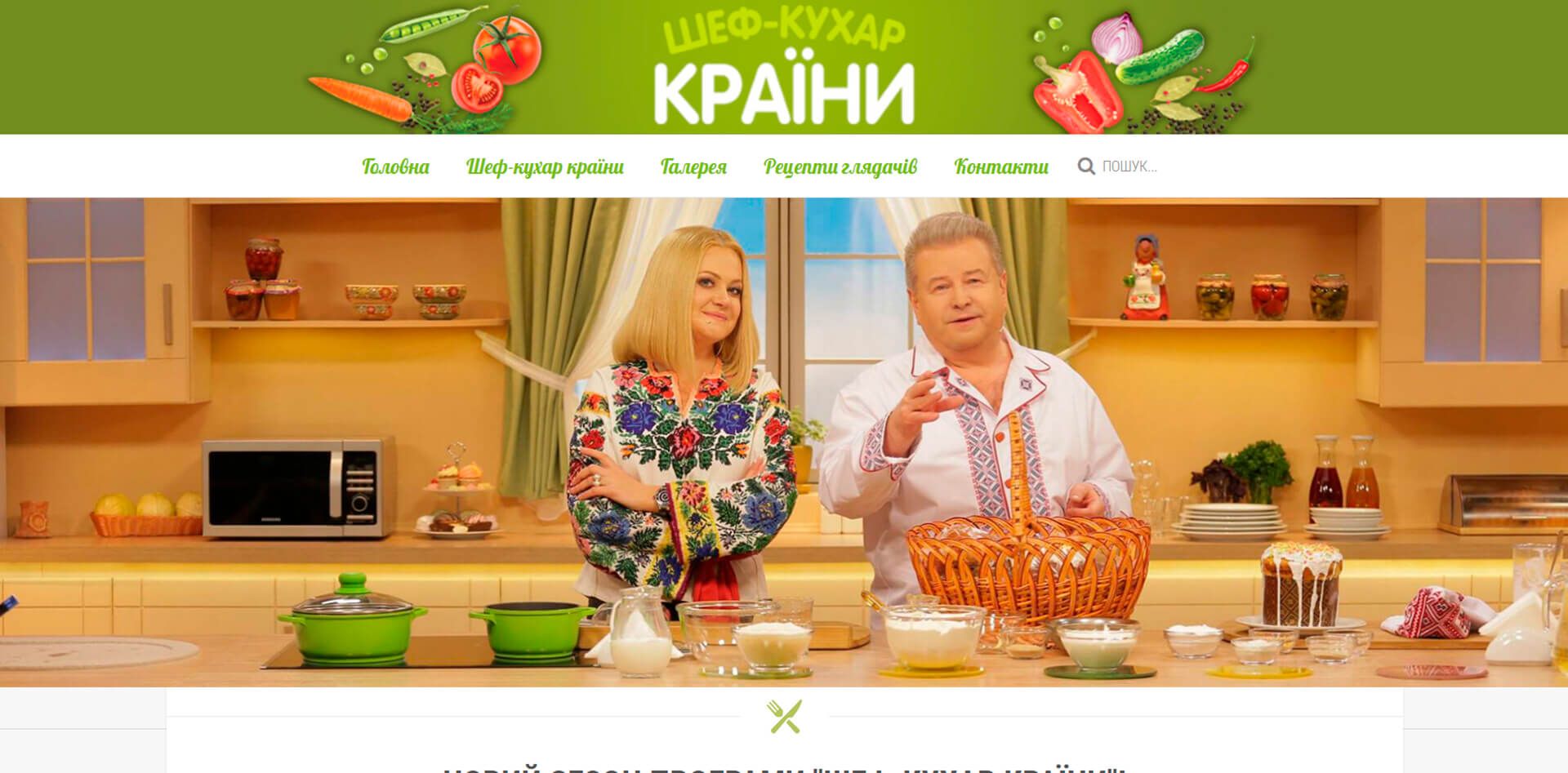
Television programme «Chef of the country» — is not just a cooking show, but a real celebration of ukrainian cuisine. In each episode of the programme, famous ukrainians introduce viewers to their own recipes for traditional ukrainian dishes.
The feature of the program is its format. In each issue, Mykhailo Poplavskyi, a famous ukrainian singer and restaurateur, meets a famous person who is a real foodie. Together they prepare an original dish that is not only tasty, but also has its own history and traditions.
"Love Ukraine like your mother! Eat ukrainian food! Support ukrainian! Buy only ukrainian! Let's keep the ukrainian wave together!"
Programme «Chef of the country» — is not only about cooking, but also about culture. In each episode, the programme's guests talk about their lives, their hobbies and what ukrainian cuisine means to them.
Programme «Chef of the country» — is a bright and positive project that unites people around the love of ukrainian cuisine.
Project tasks
To comprehensively develop and implement a modern website for the TV show «Chef of the country», taking into account the following tasks:
- develop an interface design that will be intuitive and convenient for users. The interface should be adaptive so that it can be used comfortably on different devices;
- create animation of individual blocks and elements of the site to make it more interesting and informative. Animation should be smooth and high-quality, so as not to irritate users;
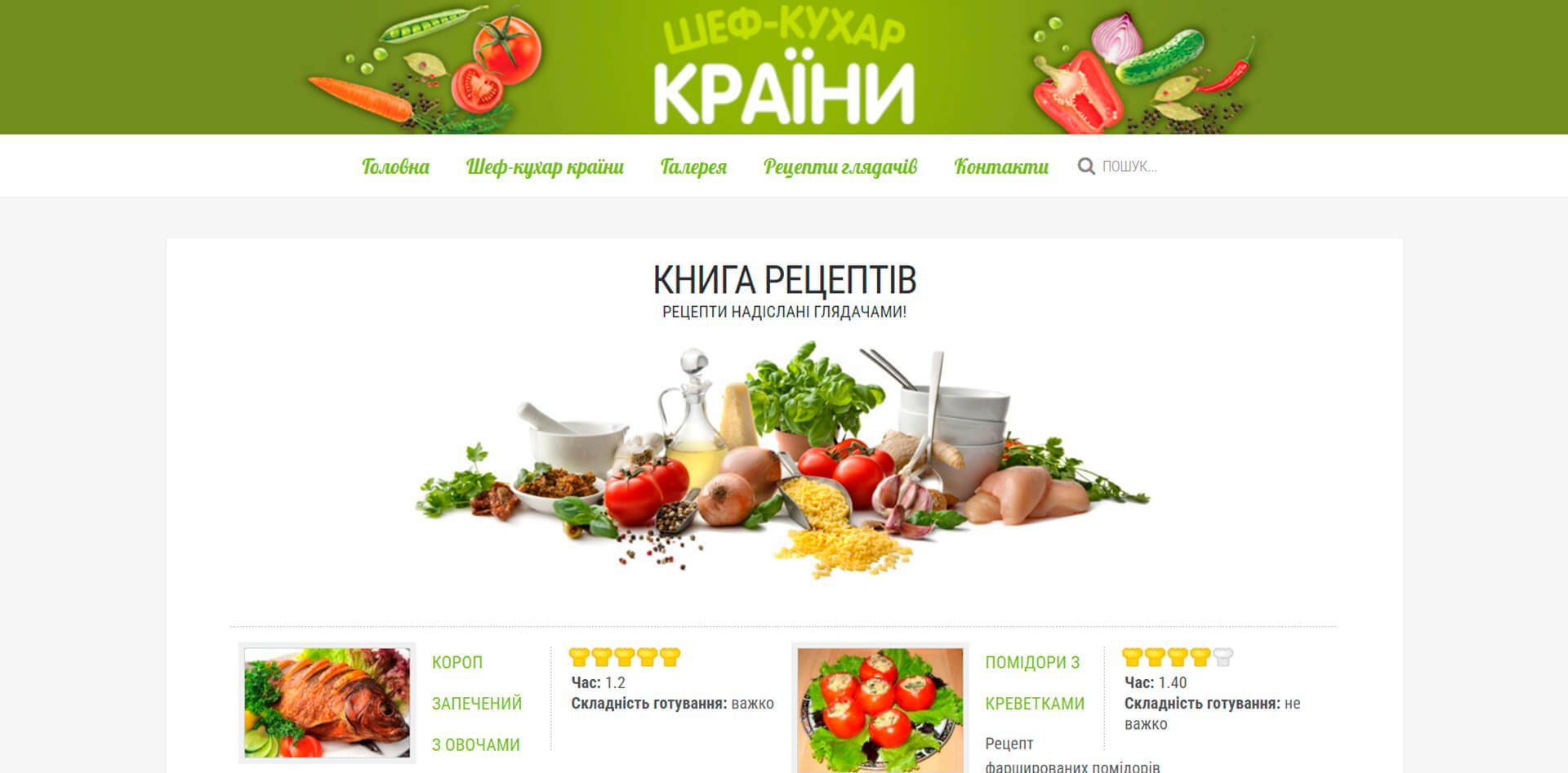
- create a "cookbook" with recipes for all the dishes that were prepared in the show. The book should be structured and easy to search;
- create a photo gallery with photos from the set of the show;
- integrate the show's YouTube channel into the site so that users can easily watch episodes of the show.
Result of the work
This short video demonstrates the elegant design, user-friendly navigation, and multifunctionality of the «Chef of the country» cooking show's website.
In the end, the following was done to ensure the successful implementation of the project:
- a marketing campaign was conducted on the Internet to raise awareness of the project and attract users. The campaign included the creation and promotion of the site in social networks, as well as the placement of advertisements on popular sites and in the search engine;
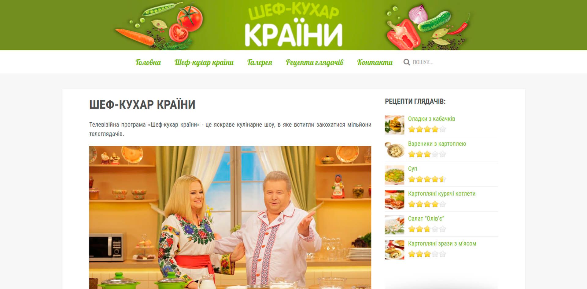
- an interface design has been developed that meets the needs and wishes of users. The interface was developed taking into account the principles of usability, so that it is easy and convenient to use;
- processed and optimized graphics to make them more qualitative and accessible. Graphics have been adapted for different devices and screen sizes;
- filled with textual information that is relevant and useful to users. Textual information included news about the show, recipes for dishes that were prepared on the show, and information about the show's contestants;
- animation of objects was created to make the site more interesting and informative. The animation was smooth so as not to irritate users;
- integrated the show's YouTube channel into the site so users can easily watch episodes of the show;
- created a photo gallery with photos from the shooting of the show;
- created a contact form so users can easily get in touch with the show team;
- the site was hosted and configured on a hosting that was chosen taking into account the requirements of the project to ensure high availability of the site.
Additional measures implemented after the launch of the site:
- created a news section where the latest news about the show is published;
- created a chat section for users to discuss the show and share their recipes.
These measures are aimed at making the site more informative, interesting and useful for users. They also help attract new users and improve engagement with existing users.


